Maysa Design
Professional Interior Design and Construction Company


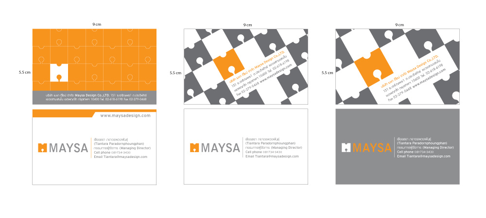
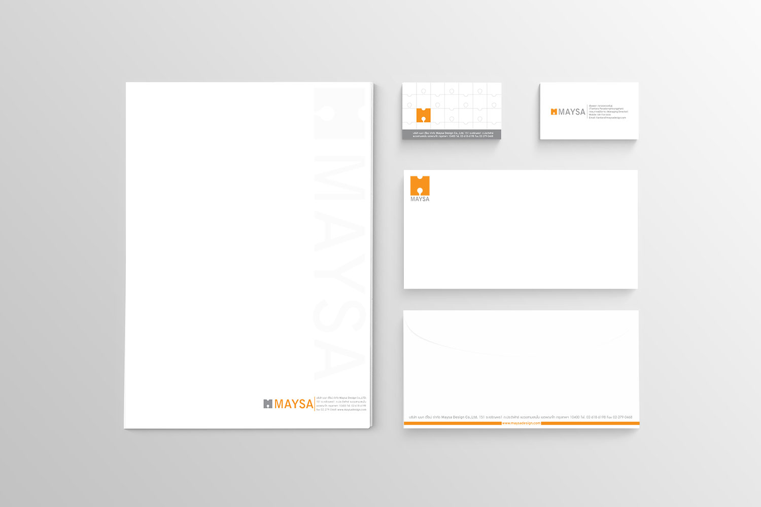
The COLOURS in two tone, Grey and Orange. Orange gives a feeling of dynamic energetic power and creative while Grey means metal, steel, iron, cement, a colour of construction materiel. The characteristics of TYPOGRAPHIC are strong and stable. ‘M A Y S A’ figures are similar to the iron bars in construction.
Business card continued the idea of puzzle that every pieces are important – absent Maysa Design that picture could not complete. The envelop and business paper are simple, clean and model.
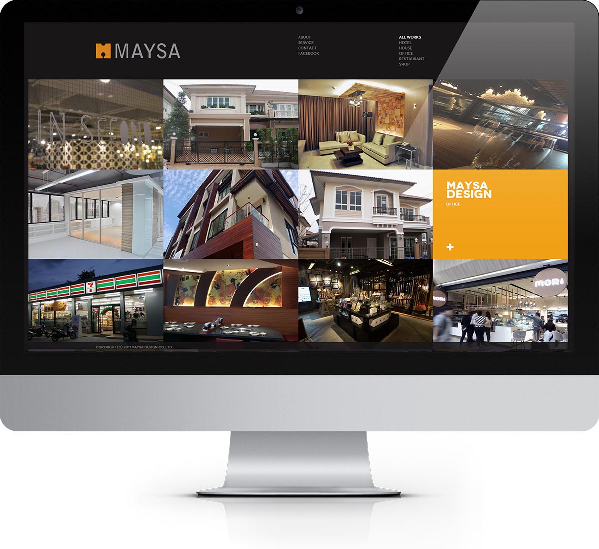
For the company website. First page shows all work company’s portfolio with the navigation in the top of the page, filter work by categories and dark background. Colour hightlight on mouseover and name of project. Project detail and project image shows in each project page and social network share. Please visit : www.maysadesign.com